As a graphic designer there are plenty of avenues of inspiration that come from being in Florence. I’ve decided to focus on one that is a major challenge for most designers to research and use properly. This challenge is typography and the use of typographic materials. Typography is the arrangement of letters and text to communicate clear ideas. Whether those ideas are to enlighten, warn, intrigue, or comfort.
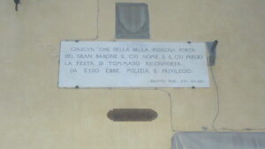
A plaque found in a local Piazza shows the use of Roman Numerals.
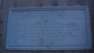
A plaque found in a local Piazza shows the use of Roman Numerals.
Italy has one of the richest artistic histories in the world, and due to this the influence of modern day typography is undeniable. The influence can date as far back as the use of roman numerals. Originally used for musical and mathematical purposes the design for the font has been used since its creation. Furthermore one of the most pivotal eras in Italy the Renaissance birthed the humanist movement, and out came a new topographic adaptation. Called littera humanistica (humanist scripts), along with Roman numerals there are plenty of examples of how these fonts contribute and exist throughout Florence.
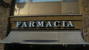
Farmacia sign showing the adaptation of the typefaces.
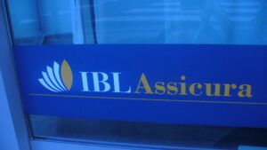
Bank Logo, displays a more literal use of Roman Numeral style with a bolder look.
Roman Numerals were invented to be used for music and counting in old Roman times. However many of the characteristics of the typeface are used to enhance the energy of text today. Such as the serifs that add to and can connect each numeral, down to the perfect symmetry of the letters. These qualities allow for fonts to resemble serious, historical style to reflect upon their designs.
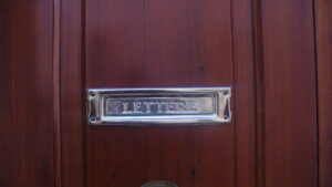
Another display of a literal use of Roman Numeral style with a bolder look.
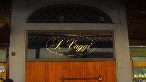
Jewelry store logo in a Script font, extremely expressive and reflective of humanist scripts.
The humanistic scripts came at a time where Italy was renouncing their barbaric past and moving into a new era. An era where life was celebrated and gothic design was the most popular. These scripts still utilized serifs, which are ridges projecting off the edge of line marks. The serifs on the scripts were more whimsical and the letters lack symmetry. With this font there is more of a fantasy feeling, that can be easily turned into a more modern day gothic or fairytale vibe.
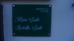
Apartment Sign, reflective of humanist scripts a modern adaptation of releasing barbaric history.
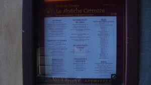
Restaurant menu and Logo, enhancing the fantasy aspect of humanistic scripts this is a good example of the influence of the Renaissance.
In the streets of Florence you can find the influence of these types of fonts on shop signs and even graffiti art. The places I see these designs the most are pharmacies and apartment buildings. There you will find “Farmacia” written in humanistic fonts,with whimsical serifs but more symmetrical like roman numerals. Then with the names on the tags, most are in heavy script, more like cursive. Which can be seen as an adaptation of humanistic script, the whimsical nature with the same professionality that the Italian renaissance yearned for.
Written by: Jaylen, Fall 2023 Florence Student from Wayne State University
Works Cited
alessandralanot. “Travel Diary: Florence Fonts & Finds.” Life After Breakfast, 12 June 2016, https://lifeafterbreakfast.ph/
Hannah, Jaye. “Typography: What Is It? The Complete Guide for 2023.” CareerFoundry, 20 Jan. 2021, https://careerfoundry.com/en/
“Site.” Humanistic Script, https://www.paleography-hexe.
